library(tidyverse) # data processing
library(tidybayes) # for tidy format model draws
library(brms)      # Bayesian regression
library(see)       # prettier colour schemes
library(ggridges)  # a nice package for nice plots

# set the theme
theme_set(theme_bw() +
            theme(legend.position = "bottom"))

# for reproducibility
set.seed(970431)

# The colours I used for any plots
myColours <- c("#c62828", "#283593", "#2e7d32", "#f9a825")P-values and Clinical Decisions
Introduction
I was asked by an old master’s student for some advice about presenting the results of some work they had done looking at readmission amongst people discharged to a ward vs. being sent home. Obviously, we can appreciate that there may be some differences in terms of the outcomes between people sent home and those remaining in hospital. While I was very excited to see him using R for his analysis and Rmarkdown to show his working, something else didn’t sit well with me. His question was whether there was any “significant” difference in the probability of these people being readmitted to hospital 30 days after being discharged.
I have no qualms with discussing the problems of significance testing in a host of different contexts (follow this link for a fantastic discussion of inappropriate applications of significance testing), and as such this grabbed my attention. The approach I prefer to take is one that looks at what we could reasonably surmise given the data that is in front of us. Therefore, I prefer to employ Bayesian methods to answer most (scientific) questions I’m presented with.
Being the pedant I am, I took the work and offered an alternative perspective that I believe safeguarded against some of the issues that are mentioned in the paper I referenced above. The aim of this isn’t to discourage people from using p-values, but to try and anticipate how your research would be used by stakeholders. If they aren’t likely to understand the nuances of Null Hypothesis Significance Testing, or may misinterpret the results, then maybe it’s not the best idea to use these tools.
Packages used
Here are the packages I used for this post:
The Problem and the data
The example offered was a small dataset containing 51 patients with diabetes who were either discharged home or to another ward, and a record of whether they had been readmitted within 30 days. I recreated these data using the following code:
df_readmission <- tibble(Group = rep(c("Home", "Ward"), c(24, 27)),
                         readmit = c(rep(c(1, 0), c(2, 22)), rep(c(1, 0), c(1, 26)))) %>%
  mutate(Group = factor(Group, levels = c("Ward", "Home")))
First thing I did was recreate the analysis I was presented with.
df_fisher <- df_readmission %>%
  group_by(Group) %>%
  summarise(totalNoReadmit = n() - sum(readmit),
            totalReadmit = sum(readmit))

# Needs to be a matrix for the fisher.test function...
matrix_fisher <- as.matrix(df_fisher %>% select(totalNoReadmit, totalReadmit))
dimnames(matrix_fisher)[[1]] <- c("Ward", "Home")

fisherResults <- fisher.test(matrix_fisher)
fisherResults
    Fisher's Exact Test for Count Data

data:  matrix_fisher
p-value = 0.5955
alternative hypothesis: true odds ratio is not equal to 1
95 percent confidence interval:
   0.1138541 144.5825688
sample estimates:
odds ratio
   2.32493
Which replicated the results (not surprisingly, as they’d done a very good job of showing their working). From these results, we can see that there is no significant difference between the risk of readmission for those discharged home vs. those discharged to a ward. Less statistically minded people may, through no fault of their own, mistakenly interpret this as “there is no difference in the risk of readmission between those discharged home or a ward, so let’s send them all home”. Which 1) isn’t how NHST works, and 2) would be a very strong statement to make given the amount of uncertainty present in our estimate.
The best estimate for the Odds of being sent how is 2.32, but the range goes from a huge reduction (0.11) to an incredible increase (144.58). I’m not saying that this would certainly be ignored, but we have to be careful in how we present these results. Therefore, I offered an alternative approach using Bayesian methods.
An alternative approach
visualising the uncertainty in the data
First, I considered that the dataset is very small. This raised the question of: what sort of probability values could reasonably produce data like these? Making the assumption that a beta distribution could suitably represent these data, I produced a plot to perhaps answer this question.
x <- seq(0, .3, length.out = 100)
df_beta <- df_fisher %>%
  expand_grid(tibble(x = x)) %>%
  mutate(dens = dbeta(x, totalReadmit, totalNoReadmit))

df_beta %>%
  ggplot(aes(x, dens, colour = Group)) +
  geom_path() +
  scale_colour_manual(values = myColours)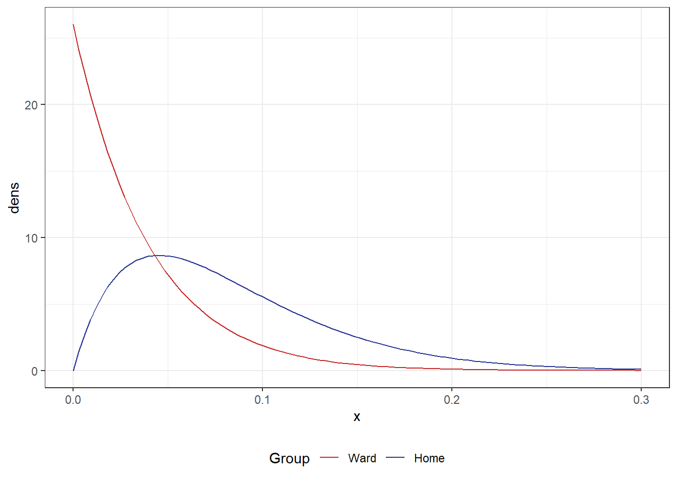
We can see that there’s a large degree of overlap in these two distributions. However a quick visual inspection would suggest that the Ward group was more likely to not be readmitted given the majority of the curve is lower than the Home group. Given we have such small numbers, it is unsurprising we didn’t observe a significant difference.
Therefore, I felt it best to offer a Bayesian approach. The way I viewed these data is that for 51 people, we have a record or whether they were readmitted after being discharged, and a grouping variable of where they were discharged to. So this seemed like a straightforward logistic regression problem
Model fitting
First thing’s first, I fit a model using the default priors from the brms package.
m_defaultPriors <- brm(readmit ~ Group,
                       data = df_readmission,
                       chains = 1,
                       family = "bernoulli",
                       sample_prior = T,
                       seed = 987421)
SAMPLING FOR MODEL 'anon_model' NOW (CHAIN 1).
Chain 1:
Chain 1: Gradient evaluation took 1.8e-05 seconds
Chain 1: 1000 transitions using 10 leapfrog steps per transition would take 0.18 seconds.
Chain 1: Adjust your expectations accordingly!
Chain 1:
Chain 1:
Chain 1: Iteration:    1 / 2000 [  0%]  (Warmup)
Chain 1: Iteration:  200 / 2000 [ 10%]  (Warmup)
Chain 1: Iteration:  400 / 2000 [ 20%]  (Warmup)
Chain 1: Iteration:  600 / 2000 [ 30%]  (Warmup)
Chain 1: Iteration:  800 / 2000 [ 40%]  (Warmup)
Chain 1: Iteration: 1000 / 2000 [ 50%]  (Warmup)
Chain 1: Iteration: 1001 / 2000 [ 50%]  (Sampling)
Chain 1: Iteration: 1200 / 2000 [ 60%]  (Sampling)
Chain 1: Iteration: 1400 / 2000 [ 70%]  (Sampling)
Chain 1: Iteration: 1600 / 2000 [ 80%]  (Sampling)
Chain 1: Iteration: 1800 / 2000 [ 90%]  (Sampling)
Chain 1: Iteration: 2000 / 2000 [100%]  (Sampling)
Chain 1:
Chain 1:  Elapsed Time: 0.028 seconds (Warm-up)
Chain 1:                0.032 seconds (Sampling)
Chain 1:                0.06 seconds (Total)
Chain 1:
# show model summary
summary(m_defaultPriors) Family: bernoulli
Links: mu = logit
Formula: readmit ~ Group
Data: df_readmission (Number of observations: 51)
Draws: 1 chains, each with iter = 2000; warmup = 1000; thin = 1;
total post-warmup draws = 1000
Regression Coefficients:
Estimate Est.Error l-95% CI u-95% CI Rhat Bulk_ESS Tail_ESS
Intercept -3.35 0.99 -5.55 -1.81 1.01 427 433
GroupHome 0.79 1.29 -1.68 3.40 1.00 403 489
Draws were sampled using sampling(NUTS). For each parameter, Bulk_ESS
and Tail_ESS are effective sample size measures, and Rhat is the potential
scale reduction factor on split chains (at convergence, Rhat = 1).Like most people, I’m not able to transform these values onto a scale that makes sense off the top of my head. So, I’ve made a quick function that will summarise the the outputs on a ratio scale instead. Note, there’s almost definitely a neater function out there, but we’re not here to make the prettiest most efficient functions.
# quick function as we'll be doing this again
myOddsRatio <- function(thisModel){
  as_draws_df(thisModel) %>%
    select(b_GroupHome) %>%
    mean_hdci(b_GroupHome, .width = c(.95)) %>%
    mutate(across(1:3, ~exp(.x)))
}

myOddsRatio(m_defaultPriors)
Warning: Dropping 'draws_df' class as required metadata was removed.# A tibble: 1 × 6
b_GroupHome .lower .upper .width .point .interval
<dbl> <dbl> <dbl> <dbl> <chr> <chr>
1 2.21 0.166 26.2 0.95 mean hdci From the above output, we can see there is still a very large amount of uncertainty about this estimate. However, the Bayesian model is a bit more certain than the original Fisher test. For those that need more convincing, take a look at Figure 2 and you can clearly see that the Bayesian model offers a more precise estimate.
Code
# setup dataset for use later
df_comparison <- tibble(
  testType = c("Fisher",
               "Bayes_defaultPriors"),
  mu       = c(fisherResults$estimate,
               exp(fixef(m_defaultPriors)[2, 1])),
  .lower   = c(fisherResults$conf.int[1],
               exp(fixef(m_defaultPriors)[2, 3])),
  .upper   = c(fisherResults$conf.int[2],
               exp(fixef(m_defaultPriors)[2, 4]))
) %>%
  mutate(testType = factor(testType, levels = c("Fisher", "Bayes_defaultPriors")))

df_comparison %>%
  ggplot(aes(mu, testType, colour = testType)) +
  geom_vline(xintercept = 1) +
  geom_point() +
  geom_linerange(aes(xmin = .lower, xmax = .upper)) +
  scale_x_log10("Odds Ratio") +
  scale_y_discrete("") +
  scale_colour_manual(values = myColours)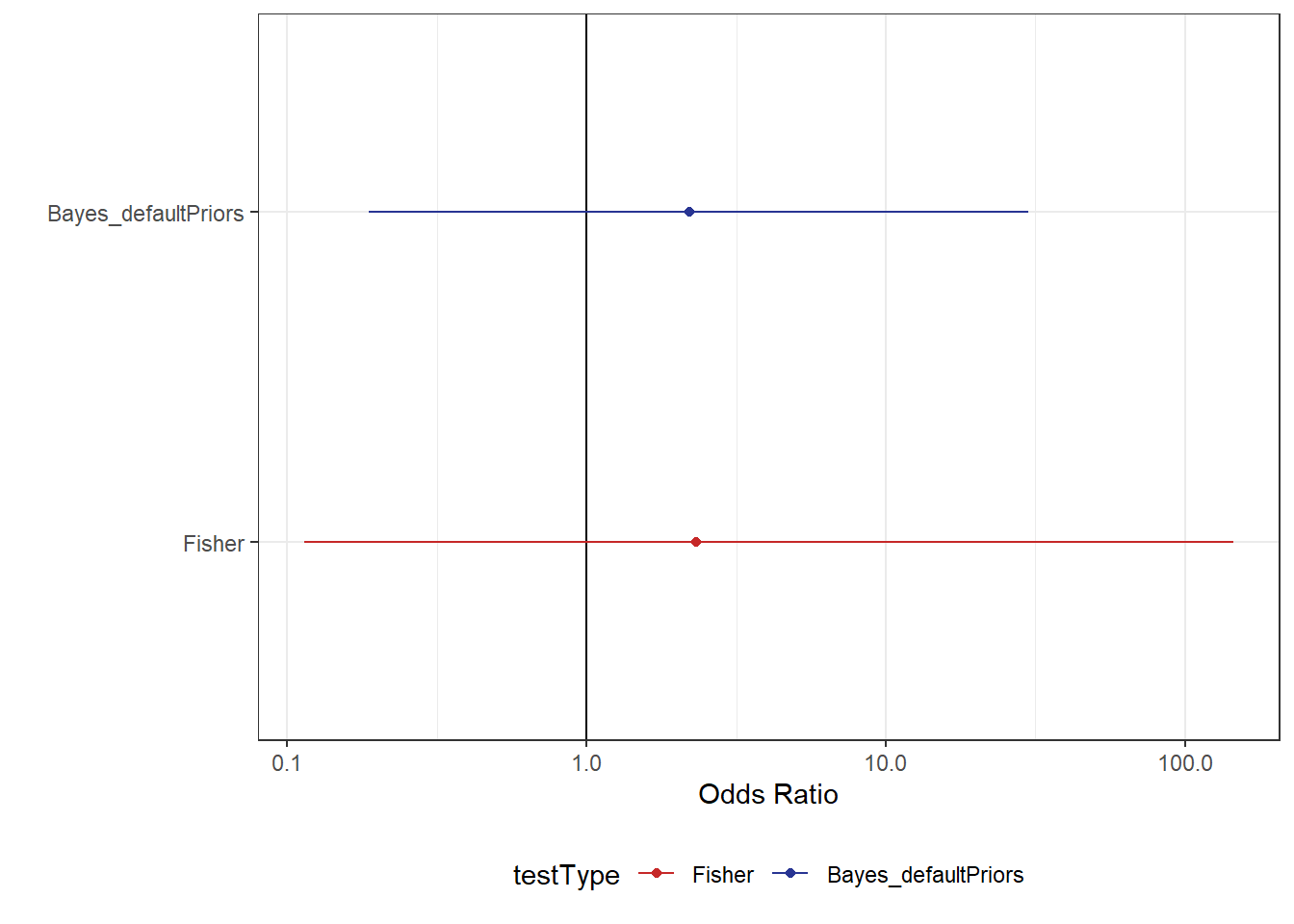
Although the Bayesian model estimates are less uncertain, we still have a large degree of uncertainty in our estimate. While this may simply be a result of having a small dataset, there are other things we should also consider when fitting these models. Given we’re using Bayesian stats now, we have the luxury of adding prior beliefs to our model. While priors can be subjective, we have a very real reason to not rely exclusively on default (or, even worse, uniform) priors when dealing with logistic regression.
More informative priors
Initial beliefs
We can retrieve the default priors from the model we implemented by using the handy function get_prior.
get_prior(readmit ~ Group,
          data = df_readmission,
          family = "bernoulli")
prior class coef group resp dpar nlpar lb ub
(flat) b
(flat) b GroupHome
student_t(3, 0, 2.5) Intercept
source
default
(vectorized)
defaultIn this case, we have flat priors on the coefficient for the effect of being discharged home. In effect, this means that every value from \(-\infty\) to \(\infty\). Which doesn’t sound very reasonable to me. However, this becomes a particular issue when handling models looking at probability. When we use the inverse logistic function on this belief (to put the values onto a probability scale), we see something undesirable happen.
# get random numbers from some range
x <- runif(1e5, -5, 5)

# perform the inverse logit function
inv_x <- plogis(x)

# plot this
tibble(p = inv_x) %>%
  ggplot(aes(p)) +
  geom_histogram(aes(y = ..density..))
Warning: The dot-dot notation (`..density..`) was deprecated in ggplot2 3.4.0.
ℹ Please use `after_stat(density)` instead.`stat_bin()` using `bins = 30`. Pick better value with `binwidth`.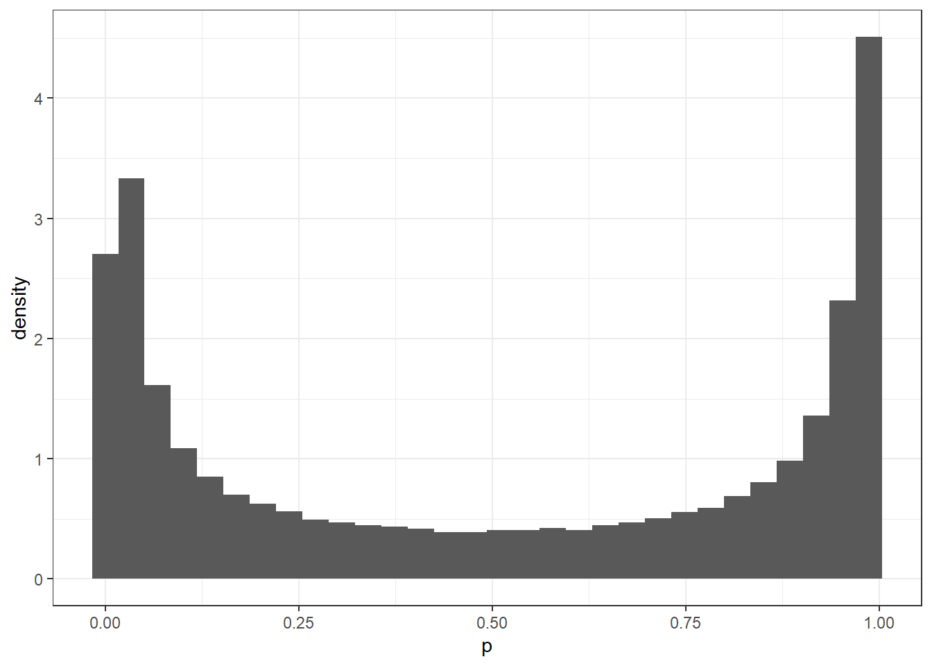
For this example, we only used numbers between -5 and 5, which occupies an incredibly small region of the range \(-\infty\) to \(\infty\), and we can already see why using priors such as these may cause issues. What the figure shows is that there is much stronger initial belief in values that are at either extreme, and so this will lead to a poorer reflection of what can actually be seen in the data. If we were to use a different prior, we could perform the same steps to look at what the prior would look like. For example, what happens if we use a Student T distribution using the same values for the intercept term in the model we already ran?
x_student <- rstudent_t(n = 1e5, df = 3, mu = 0, sigma = 2.5)

tibble(x_student = plogis(x_student)) %>%
  ggplot(aes(x_student)) +
  geom_histogram(aes(y = ..density..))
`stat_bin()` using `bins = 30`. Pick better value with `binwidth`.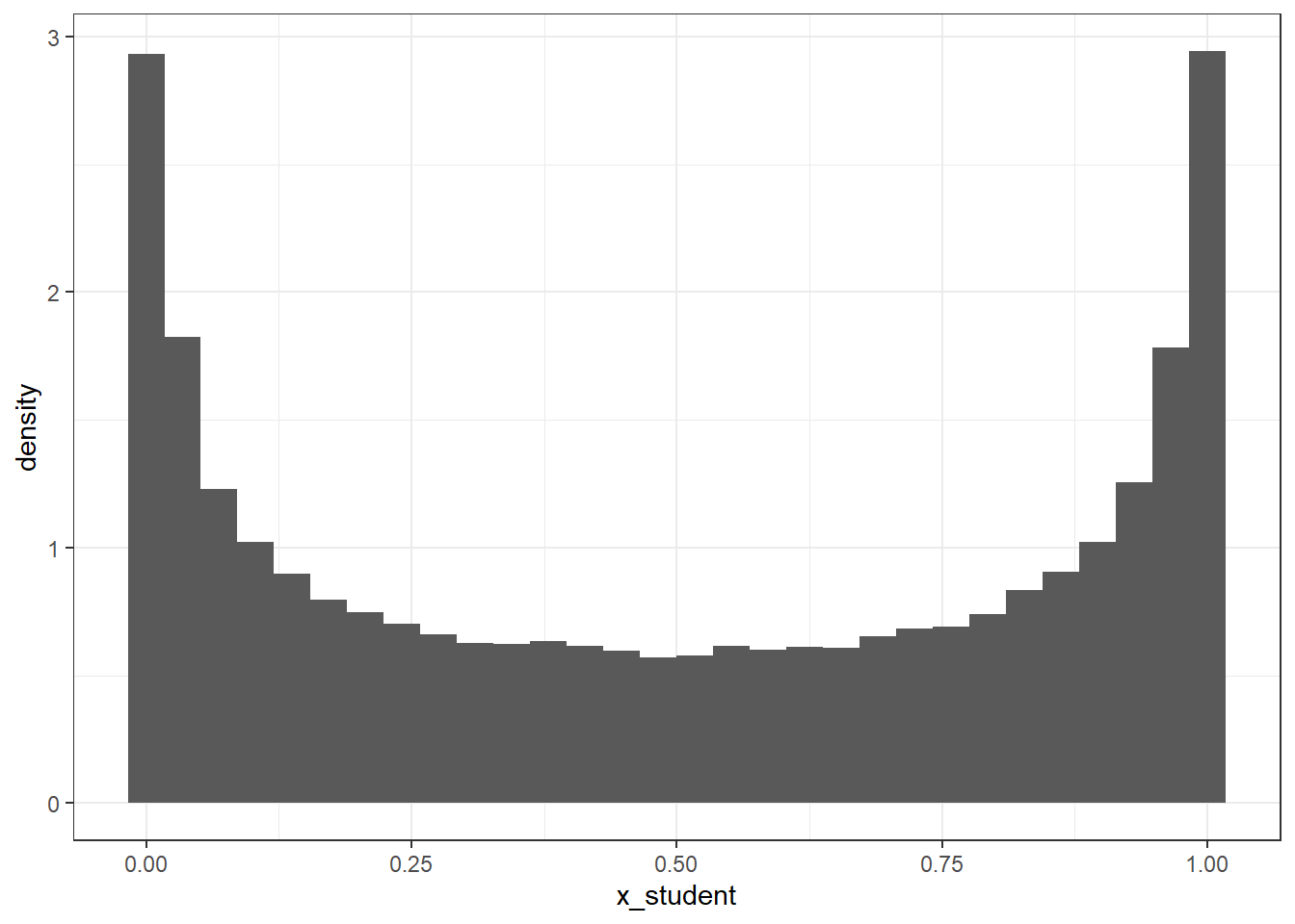
Looks a little bit better, but what if we made the standard deviation smaller?
x_student <- rstudent_t(n = 1e5, df = 3, mu = 0, sigma = 1)

tibble(x_student = plogis(x_student)) %>%
  ggplot(aes(x_student)) +
  geom_histogram(aes(y = ..density..))
`stat_bin()` using `bins = 30`. Pick better value with `binwidth`.
This looks like a much more reasonable initial assumption; not only are the extremes represented to a lesser extent, there is also a smaller difference in the density between the lowest and highest points. Playing around with these values is encouraged to see how the prior belief changes, but hopefully this quick demonstration gives some insight into why this may cause a problem.
refitting the model
Now we have an understanding of our model’s prior beliefs, and what these would mean for the results, we can use this to inform in a model and see how the results change.
# add in somewhat informative priors
m_studentPrior_sigma1 <- update(m_defaultPriors,
                                prior = c(prior(student_t(3, 0, 1), class = "b"),
                                          prior(student_t(3, 0, 1), class = "intercept")))
The desired updates require recompiling the modelCompiling Stan program...Start sampling
SAMPLING FOR MODEL 'anon_model' NOW (CHAIN 1).
Chain 1:
Chain 1: Gradient evaluation took 3e-05 seconds
Chain 1: 1000 transitions using 10 leapfrog steps per transition would take 0.3 seconds.
Chain 1: Adjust your expectations accordingly!
Chain 1:
Chain 1:
Chain 1: Iteration:    1 / 2000 [  0%]  (Warmup)
Chain 1: Iteration:  200 / 2000 [ 10%]  (Warmup)
Chain 1: Iteration:  400 / 2000 [ 20%]  (Warmup)
Chain 1: Iteration:  600 / 2000 [ 30%]  (Warmup)
Chain 1: Iteration:  800 / 2000 [ 40%]  (Warmup)
Chain 1: Iteration: 1000 / 2000 [ 50%]  (Warmup)
Chain 1: Iteration: 1001 / 2000 [ 50%]  (Sampling)
Chain 1: Iteration: 1200 / 2000 [ 60%]  (Sampling)
Chain 1: Iteration: 1400 / 2000 [ 70%]  (Sampling)
Chain 1: Iteration: 1600 / 2000 [ 80%]  (Sampling)
Chain 1: Iteration: 1800 / 2000 [ 90%]  (Sampling)
Chain 1: Iteration: 2000 / 2000 [100%]  (Sampling)
Chain 1:
Chain 1:  Elapsed Time: 0.027 seconds (Warm-up)
Chain 1:                0.03 seconds (Sampling)
Chain 1:                0.057 seconds (Total)
Chain 1: summary(m_studentPrior_sigma1) Family: bernoulli
Links: mu = logit
Formula: readmit ~ Group
Data: df_readmission (Number of observations: 51)
Draws: 1 chains, each with iter = 2000; warmup = 1000; thin = 1;
total post-warmup draws = 1000
Regression Coefficients:
Estimate Est.Error l-95% CI u-95% CI Rhat Bulk_ESS Tail_ESS
Intercept -3.06 0.78 -4.77 -1.73 1.01 480 413
GroupHome 0.39 0.84 -1.17 2.17 1.00 605 568
Draws were sampled using sampling(NUTS). For each parameter, Bulk_ESS
and Tail_ESS are effective sample size measures, and Rhat is the potential
scale reduction factor on split chains (at convergence, Rhat = 1).Now we can add these results to our plot from before and see what this has done to the uncertainty in our estimates:
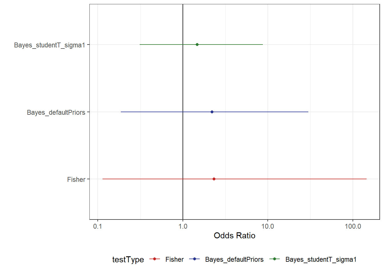
From Figure 6, we can now see that the uncertainty in our estimate is reduced by quite a substantial amount. Something else that might be beneficial for a model fit is to change the “mean” value in the prior. At the moment, we’ve centred the prior on a value of 50% which would seem to be a lot higher than the actual data suggests. In this case, we might try something on the lower end to compare the model results. For example, maybe we think there is a 10% change people would be readmitted on average.
# rerun the model with the intercept as 10%
m_studentPrior_10percent <- update(m_defaultPriors,
                                   prior = c(prior(student_t(3, 0, 1), class = "b"),
                                             prior(student_t(3, qlogis(.1), 1), class = "intercept")))
The desired updates require recompiling the modelCompiling Stan program...Start sampling
SAMPLING FOR MODEL 'anon_model' NOW (CHAIN 1).
Chain 1:
Chain 1: Gradient evaluation took 2.8e-05 seconds
Chain 1: 1000 transitions using 10 leapfrog steps per transition would take 0.28 seconds.
Chain 1: Adjust your expectations accordingly!
Chain 1:
Chain 1:
Chain 1: Iteration:    1 / 2000 [  0%]  (Warmup)
Chain 1: Iteration:  200 / 2000 [ 10%]  (Warmup)
Chain 1: Iteration:  400 / 2000 [ 20%]  (Warmup)
Chain 1: Iteration:  600 / 2000 [ 30%]  (Warmup)
Chain 1: Iteration:  800 / 2000 [ 40%]  (Warmup)
Chain 1: Iteration: 1000 / 2000 [ 50%]  (Warmup)
Chain 1: Iteration: 1001 / 2000 [ 50%]  (Sampling)
Chain 1: Iteration: 1200 / 2000 [ 60%]  (Sampling)
Chain 1: Iteration: 1400 / 2000 [ 70%]  (Sampling)
Chain 1: Iteration: 1600 / 2000 [ 80%]  (Sampling)
Chain 1: Iteration: 1800 / 2000 [ 90%]  (Sampling)
Chain 1: Iteration: 2000 / 2000 [100%]  (Sampling)
Chain 1:
Chain 1:  Elapsed Time: 0.034 seconds (Warm-up)
Chain 1:                0.035 seconds (Sampling)
Chain 1:                0.069 seconds (Total)
Chain 1: summary(m_studentPrior_10percent) Family: bernoulli
Links: mu = logit
Formula: readmit ~ Group
Data: df_readmission (Number of observations: 51)
Draws: 1 chains, each with iter = 2000; warmup = 1000; thin = 1;
total post-warmup draws = 1000
Regression Coefficients:
Estimate Est.Error l-95% CI u-95% CI Rhat Bulk_ESS Tail_ESS
Intercept -3.07 0.81 -4.79 -1.72 1.00 527 551
GroupHome 0.43 0.86 -1.10 2.23 1.00 720 415
Draws were sampled using sampling(NUTS). For each parameter, Bulk_ESS
and Tail_ESS are effective sample size measures, and Rhat is the potential
scale reduction factor on split chains (at convergence, Rhat = 1).df_comparison <- df_comparison %>%
bind_rows(
tibble(
testType = c("Bayes_studentT_10percent"),
mu = c(exp(fixef(m_studentPrior_10percent)[2, 1])),
.lower = c(exp(fixef(m_studentPrior_10percent)[2, 3])),
.upper = c(exp(fixef(m_studentPrior_10percent)[2, 4]))
)
) %>%
mutate(testType = factor(testType, levels = c("Fisher", "Bayes_defaultPriors",
"Bayes_studentT_sigma1",
"Bayes_studentT_10percent")))
df_comparison %>%
ggplot(aes(mu, testType, colour = testType)) +
geom_vline(xintercept = 1) +
geom_point() +
geom_linerange(aes(xmin = .lower, xmax = .upper)) +
scale_x_log10("Odds Ratio") +
scale_y_discrete("") +
scale_colour_manual(values = myColours)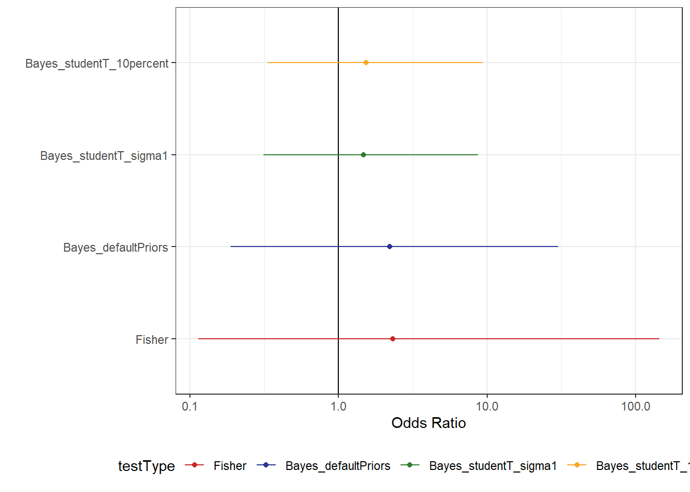
Here, we don’t see much of a change in the Ratio, but there is a small gain in terms of certainty. Though, perhaps we’re not showing the model results in a way that is best suited to answering this question.
Another way to show the data
Admittedly, I have somewhat comitted a sin with the above figures, but I do have an explanation. Bayesian statistics isn’t pre-occupied with what IS and ISN’T significant, but rather more interested in what conclusions could reasonably be supported by the data. In showing only the 95% intervals, we’re hiding some of the information that the model is communicating to us. The reason I did this is because we have a mixture of Frequentist and Bayesian methods being applied and shown in the one figure, and I wanted to draw comparisons to the initial analysis.
However, I think this pushes us towards the binary thinking that is often encourage by things like p-values and as such I think these figures should be avoided if possible. Additionally, if we circle back to the link I shared earlier which discusses a few examples of p-values being used incorrectly, figures like these run the risk of encouraging errors in judging what the results show. The risk we run is that the end user will look at these plots and wrongly infer: “The interval contains 1 (no effect), and so there is no difference between the groups, and therefore we should send everyone home”. This isn’t what the analysis shows, however it’s not impossible to imagine people mistakenly making this judgement. The way I see it, it is our job to try and avoid people making these incorrect statements and the best method for doing this is to clearly communicate the model results in a way that is more readily understood. Thankfully, Credibility Intervals make more intuitive sense, so we can use this to our advantage when plotting model results.
In this case, I opted to avoid the use of odds ratios and instead plot the predicted probability that someone would be readmitted given they were discharged home vs. to a ward.
Code
# function to get posterior summaries for these data
# again, not very pretty
getPost <- \(listModels){
  output <- tibble()
  for(i in 1:length(listModels)){
    output <- bind_rows(output,
                        as_draws_df(listModels[[i]]) %>%
                          select(1:2) %>%
                          mutate(modelName = names(listModels)[i]) %>%
                          rowid_to_column(var = "iter"))
  }

  return(output %>%
           mutate(b_GroupHome = b_Intercept + b_GroupHome,
                  across(c(2:3), ~exp(.x))) %>%
           gather(2:3,
                  key = "param",
                  value = "coef") %>%
           mutate(dischargeTo = ifelse(param == "b_Intercept", "Ward", "Home")))
}

getPost(list(default = m_defaultPriors,
             studentT = m_studentPrior_sigma1,
             tenPercent = m_studentPrior_10percent)) %>%
  ggplot(aes(dischargeTo, coef, colour = dischargeTo, fill = dischargeTo)) +
  stat_pointinterval(point_interval = "median_hdci",
                     .width = c(.5, .95),
                     show.legend = F) +
  stat_slabinterval(alpha = .3) +
  # add in a crude estimate from the raw data
  geom_point(data = df_readmission %>%
               rename(dischargeTo = Group) %>%
               group_by(dischargeTo) %>%
               summarise(N = n(),
                         n = sum(readmit)) %>%
               mutate(perc = n/N),
             aes(y = perc),
             size = 5, pch = 1,
             show.legend = F) +
  facet_wrap(~modelName) +
  scale_colour_manual(values = myColours) +
  scale_fill_manual(values = myColours) +
  scale_y_continuous("", labels = scales::percent_format()) +
  scale_x_discrete("")
The benefit of figure 8 is that we can now see the range of values that would be supported by these data. Although we can’t clearly estimate the magnitude of difference, what we can see is that the data support higher probabilities of readmissions for people discharged home than to a ward. Although this isn’t always the case, we can see that there is some reason to believe these people may be at more risk, though we would want more data in order to be even more certain. By coupling this figure with the previous figures looking at the odds Ratios (Figure 7), we can get a more complete picture of what is happening. The odds ratios suggest an increase (albeit uncertain) in the probability of being readmitted when discharged home, while the entire posterior shows that the risk of readmission is relatively low in both groups. In having the entire posterior visible, we can more readily make intuitive judgements about what the model is showing without having to rely on measures like p-values.
My thoughts are that the p-value in and of itself isn’t a very useful number to take away. It doesn’t really help us to understand what is happening in the data, but instead is a somewhat simplified “answer” to what are usually complicated questions. In showing the uncertainty in our estimates (either the ratio, or the probability of readmission), we can see that the data are more supportive of there being a small difference between the outcomes. However, the most clear take away here is that we could use more data to inform our estimates.
Final Thoughts
When dealing with questions like these, my main concern is always that someone will misinterpret the results. People that work in a clinical setting aren’t always trained statisticians and some will have very limited experience in understanding model outputs. In fact, this is a problem in various fields and across all levels of experience. So, just as I shouldn’t be trusted to handle a scalpel and conduct an operation, maybe we need to be considerate of the fact that some people aren’t as experienced in understanding the nuances of statistical inference (trying to be as diplomatic as possible here, surgery does come with more immediately higher stakes than wonky statistics). As the people that do this, it’s our job to walk people through out models so that they can arrive at a sensible conclusion.
What I think we need to be ok with saying (and I’m sure people will agree) is that we can’t always draw precise conclusions from our data. Especially in healthcare where the data are seldom the result of controlled experimental design outside of clinical trials. There will always be some uncertainty introduced at some point be it through small sample sizes, or even through omitted variables. In this dataset for example, it’s possible that people who were discharged home were seen a less risky patients for some reason. This would be a huge confounder in our data, and would run the risk of drawing the entirely wrong conclusions from the data. But, maybe that’s a post for another time. For now, hopefully this has been helpful/interesting.
sessionInfo()R version 4.4.2 (2024-10-31 ucrt)
Platform: x86_64-w64-mingw32/x64
Running under: Windows 10 x64 (build 19045)
Matrix products: default
locale:
[1] LC_COLLATE=English_United Kingdom.utf8
[2] LC_CTYPE=English_United Kingdom.utf8
[3] LC_MONETARY=English_United Kingdom.utf8
[4] LC_NUMERIC=C
[5] LC_TIME=English_United Kingdom.utf8
time zone: Europe/London
tzcode source: internal
attached base packages:
[1] stats graphics grDevices utils datasets methods base
other attached packages:
[1] ggridges_0.5.6 see_0.10.0 brms_2.22.9 Rcpp_1.0.14
[5] tidybayes_3.0.7 lubridate_1.9.4 forcats_1.0.0 stringr_1.5.1
[9] dplyr_1.1.4 purrr_1.0.4 readr_2.1.5 tidyr_1.3.1
[13] tibble_3.2.1 ggplot2_3.5.1 tidyverse_2.0.0
loaded via a namespace (and not attached):
[1] gtable_0.3.6 tensorA_0.36.2.1 QuickJSR_1.5.1
[4] xfun_0.51 inline_0.3.21 lattice_0.22-6
[7] tzdb_0.4.0 vctrs_0.6.5 tools_4.4.2
[10] generics_0.1.3 stats4_4.4.2 parallel_4.4.2
[13] pkgconfig_2.0.3 Matrix_1.7-1 checkmate_2.3.2
[16] distributional_0.5.0 RcppParallel_5.1.10 lifecycle_1.0.4
[19] farver_2.1.2 compiler_4.4.2 Brobdingnag_1.2-9
[22] munsell_0.5.1 codetools_0.2-20 htmltools_0.5.8.1
[25] bayesplot_1.11.1.9000 yaml_2.3.10 pillar_1.10.1
[28] arrayhelpers_1.1-0 StanHeaders_2.32.10 bridgesampling_1.1-2
[31] abind_1.4-8 nlme_3.1-166 rstan_2.32.6
[34] posterior_1.6.0.9000 tidyselect_1.2.1 digest_0.6.37
[37] svUnit_1.0.6 mvtnorm_1.3-3 stringi_1.8.4
[40] reshape2_1.4.4 labeling_0.4.3 fastmap_1.2.0
[43] grid_4.4.2 colorspace_2.1-1 cli_3.6.4
[46] magrittr_2.0.3 loo_2.8.0.9000 utf8_1.2.4
[49] pkgbuild_1.4.6 withr_3.0.2 scales_1.3.0
[52] backports_1.5.0 timechange_0.3.0 rmarkdown_2.29
[55] matrixStats_1.5.0 gridExtra_2.3 hms_1.1.3
[58] coda_0.19-4.1 evaluate_1.0.3 knitr_1.49
[61] ggdist_3.3.2 rstantools_2.4.0.9000 rlang_1.1.5
[64] glue_1.8.0 rstudioapi_0.17.1 jsonlite_1.9.0
[67] plyr_1.8.9 R6_2.6.1